A website style guide contains information and rules about your visual brand identity, and for the look & feel of your website.
If you’ve already worked with a brand designer, you’ll have a lot of this info already in your branding guidelines they provided.
If not, we will work together to create a website style guide for your design project.
What’s in a website style guide?
The visual elements on your website should be consistent with the ones on social media, your email newsletters, your business cards and any other printed material. These elements are:
- Logo Files
- Color Palette
- Typography
- Photos/Illustrations
- Other Imagery (Icons, Patterns, Backgrounds)
Logo Files
Giving me a single, low-resolution image of your logo in a PDF simply won’t do. I’ll need several versions of your logo, in several orientations and file formats.
Having black & white versions of your logos is an advantage. When your brand colors can’t be used – or when they won’t stand out – having light and dark alternatives can save the day.

Logo Orientations
- Horizontal – typically best for web use
- Vertical – stacked version is useful with long business names
- Brandmark – square or round version of logo with no text
- Wordmark – version of logo with just the text
Color Variations
- Full-color – the main version, to be used on white backgrounds
- Black – for light backgrounds or when printing in one color
- White – to use on dark backgrounds
File Formats
- SVG – infinitely scalable while keeping logos and icons sharp
- JPEG – for backgrounds
- PNG – for images with transparency
- WEBP – makes images significantly smaller, so website pages load faster
Color Palette
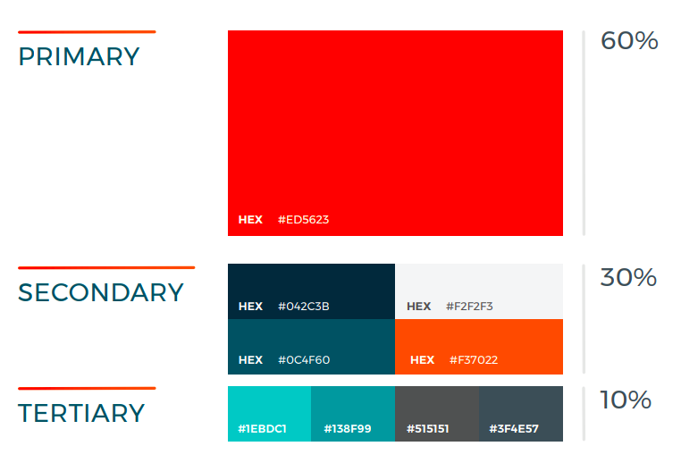
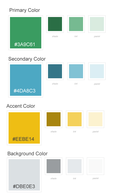
Your color palette should show the full range of colors that your brand will use for web use. I’ll need the hex codes for your colors – you can see examples of these in the photos below.
The four categories of color you should include in your web style guide are:
- Primary colors: These are your main colors, usually taken from your logo design. Most brands use one to three colors. Primary colors help people quickly identify your brand.
- Secondary colors: These are up to four colors that complement the primary colors and add depth to your primary palette.
- Neutral colors: These are for light and dark backgrounds. The most popular colors are white and gray.
- Black and White: Black and white are often overlooked in brand guidelines but it’s important to consider them. Pure black isn’t recommended for backgrounds or text on digital devices. It overpowers surrounding elements and causes eyestrain. Pure white has similar issues. We’ll use almost-black and almost-white alternative colors.
Specify how much you want each color used on your site. Let me know how often a color should be used. Show which colors to use the most, and which are highlight or accent colors, to use the least. You can show your color hierarchy as percentages or with a comparison chart.
Typography
This section of your web design style guide should include all the typography information needed for the text portions of your website.
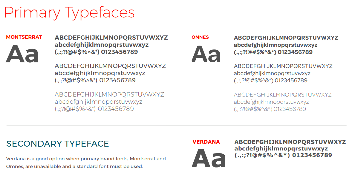
If you’ve already worked with a brand designer, you’ll have this information in your brand guidelines. When designing your website, I’ll need to know which fonts should be used for headings, subheadings, body text and calls-to-action.
Your web style guide should specify:
- the primary and the secondary typeface
- an accent typeface, if one is being used
- font sizes (large for headings, medium for subheadings, and small for paragraph text)
- font weights (light, bold, heavy)
Most small business owners use free, web-safe, universal fonts for their websites. If you choose to use a premium/paid font, you’ll have to purchase a license for web use and provide me with your license key.
Photos / Illustrations
You’ll want your website style guide to provide some guidelines for the types of imagery to use. For example, do you want photography or illustrations? If photos are used, are people looking at the camera or at each other? Are photos brightly lit or do they feature moody shadows? Which of your brand colors can be used as overlays?
This section of the web style guide should show a selection of the type of images to use for the brand, and the type of images to avoid.
For photography, focus on light, composition, and subject matter. For illustration, show style, color, and subject matter.
You can find good sources of stock images for your brand in this post on resources for your business.


File Formats
- SVG – infinitely scalable while keeping logos and icons sharp
- JPEG – for backgrounds
- PNG – for transparent backgrounds
- WEBP – makes images significantly smaller, so website pages load faster
Patterns and Backgrounds
Patterned backgrounds can add visual interest and dimension to your website. If you choose to use them, your style guide should designate if they can be used with text or other imagery placed on top.

Define your brand identity.
Learn more about develop branding that appeals to your ideal customer.

